Choice of data entry interface for street signs
The project Street Sign Generator needed a simple and fast mechanism for entering the street and house number. And I wanted to immediately see the approximate appearance of the future plate. But since all layouts are variable, that is, the size of the plate depends on the content, the solution to this problem did not come immediately. And if a different character width is a solvable problem, then different styles on the same line became a stumbling block.
What do you want?
When you select a product by options, you want the list of offers to be updated immediately. When you choose a "dark theme", you want the interface to update immediately. When you add gigabytes to a tariff, you want to immediately see the final amount.
When you generate a design, you always want to see the final version, and preferably after each data change, and preferably as soon as possible, and with all the details. The web interface is conducive to this: there are events, you can program any actions. And the generator of these plates should be no exception. Of course, some time delay is possible, because the main thing here was the similarity of the preview with the final version. Therefore, the whole story below happened.
Text — in inputs?
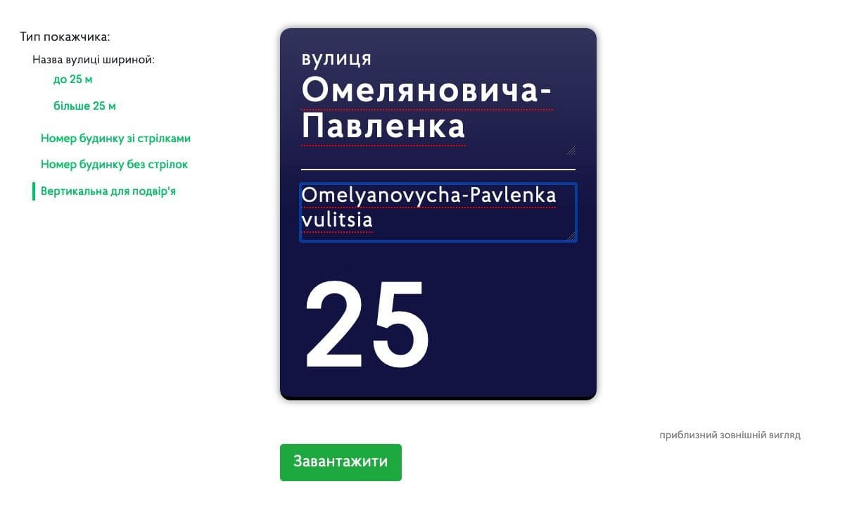
First, there was a solution that lay on the surface - to make a form in html + css in the form of a ready-made street sign board. The user would immediately enter text into the layout. The advantages of this method are obvious: the layout appears before us in a finished form. Of course, there will be some deviations from the final result, but we can always put.

I made up the sign with all the details: fillets, shadows, dimensions. In a word, I got carried away. Made methods for recalculating the width of the layout with a long name, made events from PDF for line and word wrapping. And everything would be great, but...
In the layout of the house number plate, the house number itself can consist of two parts: before and after the fraction. And the part after the fraction is typed in a smaller font. And then there are letters at the house numbers - and they have an even smaller size! And how to implement this in the input?
Surely there would be solutions in html + css, but I didn't want to waste time on this, because the question of supporting all browsers for different devices would immediately arise. But we need a simple tool that can be used from any device.
PDF-preview?
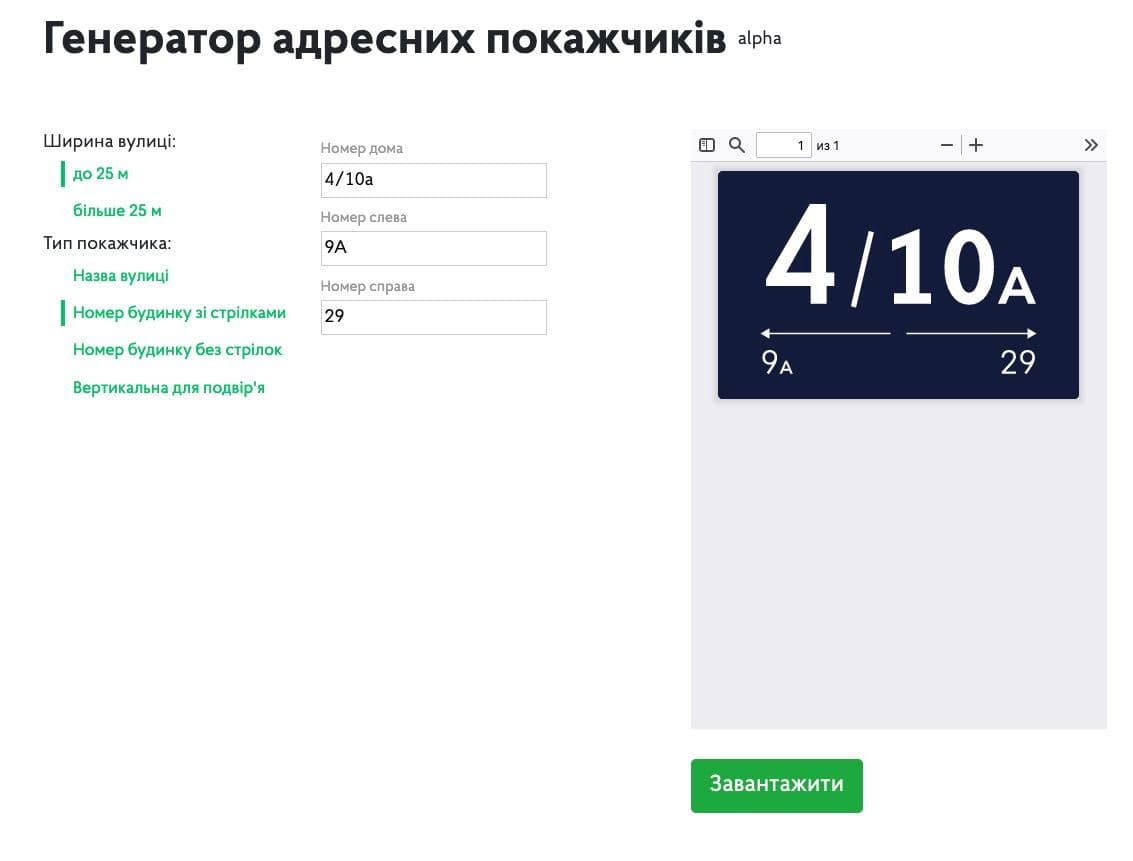
The next solution was the same obvious — to show a preview of the finished PDF-file on the site page. The user selects a layout, enters text in separate inputs, and the finished layout is displayed at the bottom of the screen. The advantages are also obvious: the result, so to speak, is obvious — the entire finished layout.

We were immediately helped by a js library that displays a PDF-file in an iframe window with some settings. And here, too, the problems began: different browsers display the interface differently: scroll bars, title and file control buttons. But that would all be nothing. The main obstacle was that the size of the layouts changed and fit completely unpredictably: part of the document was displayed or it was too small.
The biggest deviations were in Safari, and this is the main browser for all Mac developers. And this decision had to be abandoned.

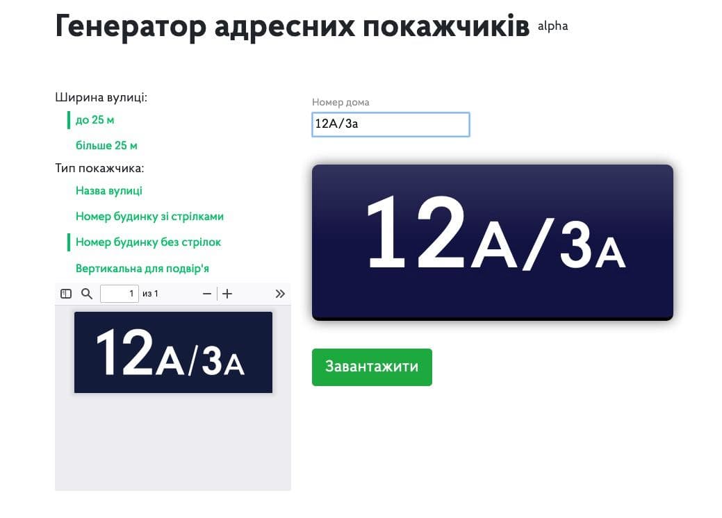
At some point, there was even an idea to show 2 preview options: for some tables - html + css, and for others — a PDF-file preview:

PDF to bitmap!
The final decision was completely unexpected. I found a js-library that turns a PDF file into a canvas. And the canvas is already a raster that fits exactly on the site with all the styles. It works more slowly, but the result met all the requirements. Since the plates are fairly simple layouts, the generation speed should be low. And so it turned out.
For users with high density monitors, I generated a raster of the desired quality. Therefore, even on retina displays, the preview files look great.
Summary
Such a difficult path "from inputs to raster" from PDF happened because these were my first variable layouts. Now there are several proven options for showing previews, from which you can choose the one suitable for future plates or signs.